
Insure & Go
Australia’s leading Travel Insurance company
Website redesign and evaluation
21 weeks | 2020
Revamp the website with a focus on Human-Centered Design to cater to the needs of our predominantly senior citizen clientele. Enhance the user experience to make their entire journey on the website as seamless as possible
About the project
The website accounts for 53% of our business in travel insurance sales. However, after speaking with clients, we've identified significant confusion in the online purchasing process. Customers struggle with understanding trip types and selecting between cruise and single cover. To address this, we need to overhaul the entire user experience to make it more intuitive and user-friendly. This redesign is prompted by a lack of effective user research.
Challenge
• User research
• User experience design including UI
• Prototyping & wire-framing
• Usability testing
My Role
Margaret Bower, 76.
“Every time I am shown something new on technology, on computer, it makes absolutely no sense to me. To me, they are only boxes but still within them everything works and we can look at the world around us, it almost incomprehensible”
The Process
OBSERVE. ASK. ANALYZE.
I used Don Norman’s Behavioural design principle in redesigning the website to focus on customers journey at each phase before the final payment (checkout).
• Validate the current website design
• Conduct user testing on current website to unveil unexpected pain points
• Focus on research results to create features that users really need
• Pin point the users current frustration on current website
• Evaluate the points using sticky notes, defining different personas
Case study
Hypothesis
Our hypothesis is that most of IAG's travel customers fall within the 60-80 age range, making it challenging to ensure a smooth end-to-end experience due to the complexity of pre-existing medical conditions. The problem originates on the landing page, where features are not tailored to this audience. Through research and iterative adjustments, aligning features with the target audience can simplify the sales process and streamline the user journey.
Research
Conducting user survey
I conducted a user survey targeting individuals aged 60 and over to assess the ease of our current web user journey. Through a series of questions, I inquired if they noticed and utilized the 'i' button for information. The survey aimed to identify pain points experienced by these users while booking travel insurance online. Valuable insights were collected from 15 participants.
Results:
Of the respondents, 83% expressed confusion regarding their trip type selection. Specifically, when their travel plans involved elements like air, land, and sea components, they were uncertain whether to choose a One-trip cover or Cruise cover option.
Solution: Simplify the asset in a way that while hovering on the ‘i’ icons, the necessary information pops up significantly as the question mark goes unnoticed with majority of the customer
A significant 68% of customers are unsure about their selected travel bracket and whether it's the right one.
Solution: Implementing a graphical representation of destination brackets.
About 71% of customers find it challenging to grasp the concept of Annual Multi-Trip (AMT) 30-45-60 day cover.
Solution: Suggest adding hover functionality to display relevant information before clicking on AMT.
An overwhelming 87% of customers have questions about their return dates to Australia, particularly whether it's the day they arrive in the country or depart from their final destination.
Solution: To clarify, we propose changing the terminology from (From-to) to (Depart from Australia - Arrival in Australia).

Current design
Current design


Research Questions
Do you happen to click on the ‘?’ button to look for more information
Do you understand the meaning of AMT 30-45-60 day cover?
Do you know where to apply promotion code when you have one?
If you’re travelling to Hawaii, what will be your destination bracket?


Personas
As per the user research, after fine tuning the user data, three personas were discovered and were put as the centre of further development process.
• Every individual had a task which incorporated a realistic goal as if they are using the best tailored information from the user data.
• The task conveyed to user highlighted the frustration and pain points and brought the interaction in limelight, which further drastically weighed the design decision in positive manner
Design Impact
After focusing on the interactional context with personas, helped me understand necessities of the users journey whilst they would like to have on the website. The process has significantly influenced the development of important design decisions.
Based on the following three personas, here are some examples -
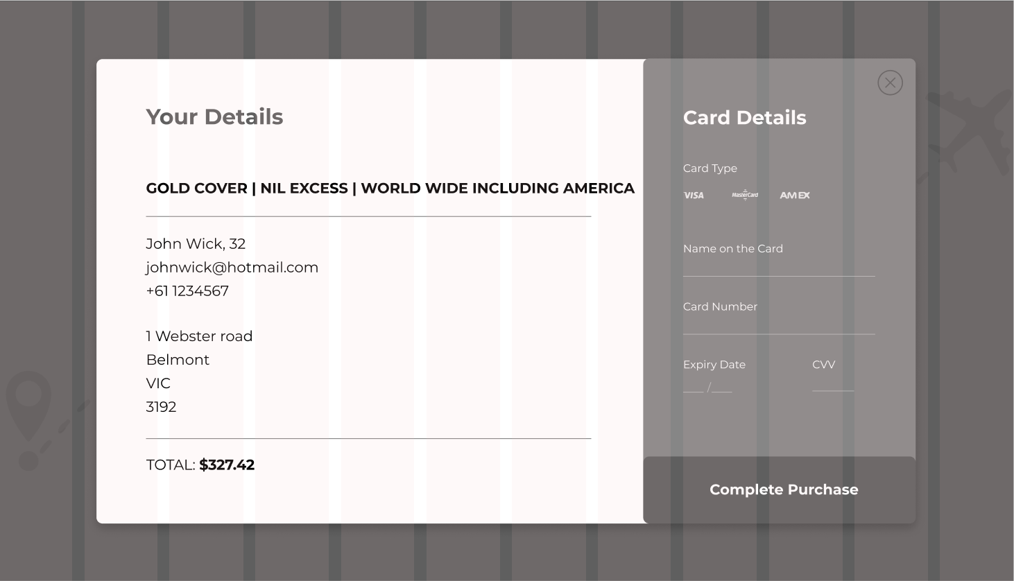
• Step by step guide until checkout (payment)
• Promotion code box should easily be visible
• Pre fill pre existing conditions for frequent traveller to save time and hassle. Done by creating a log in page which allows to hold a IAG account.
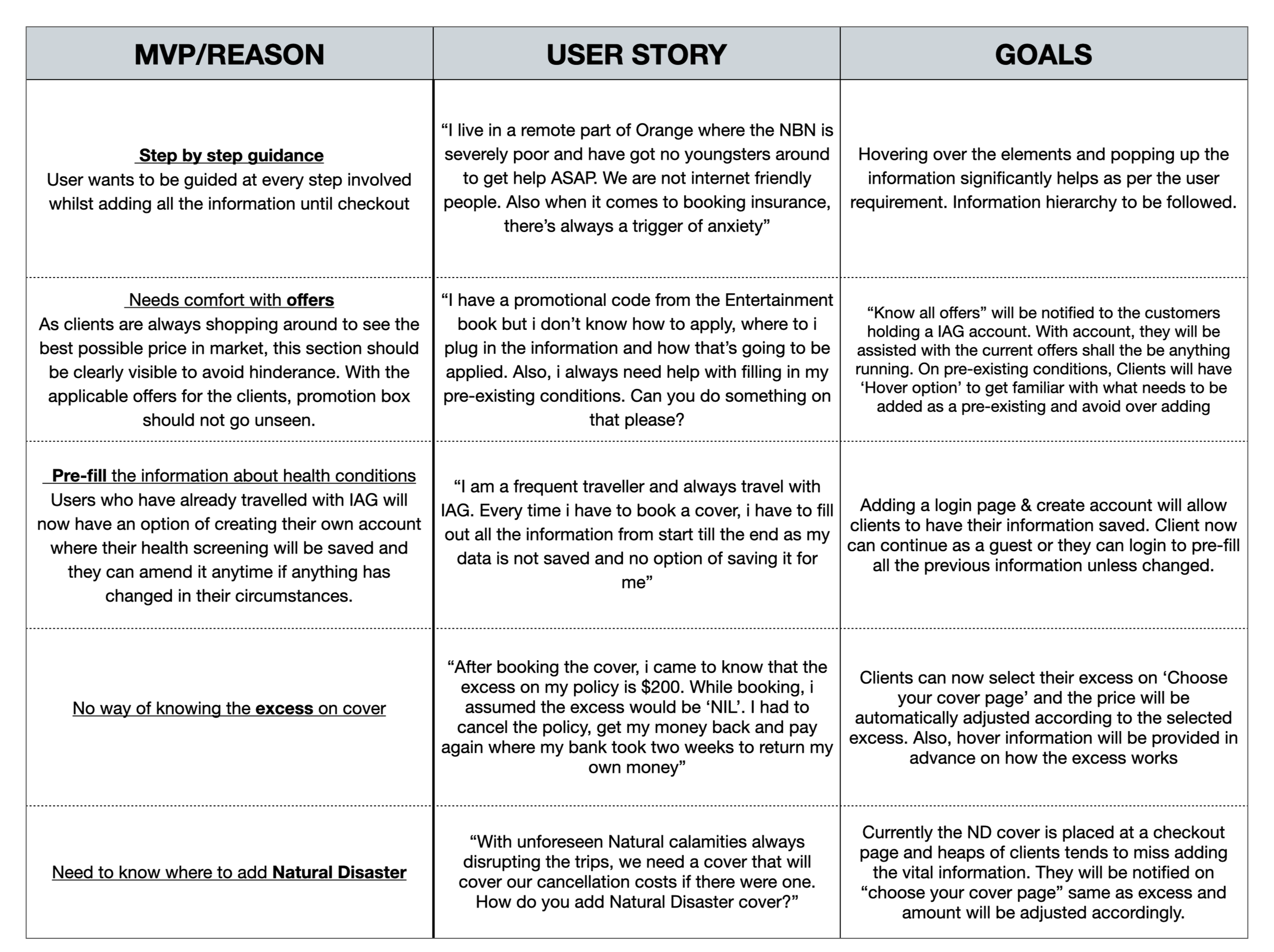
MVP & User Stories
Upon collecting all the significant user information from persona creation, the key issues such as user goals were addressed. Therefore, the lack of key decision were brought to attention and iteration was needed. Main concerns that needed solution were –
• Save time
• Login/Register at homepage
• Step by step guide to avoid confusion
• Enhancements to promo’s
• Natural disaster & excess information shown upfront.
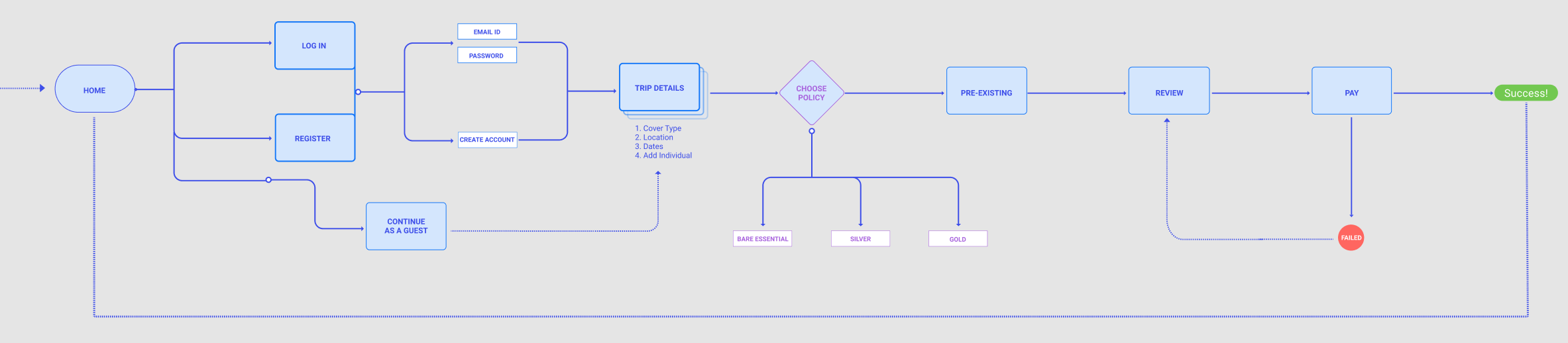
User flow
I crafted a user flow diagram to illustrate every stage of a customer's interaction with the redesigned webpages, with the primary goal of ensuring a seamless journey up to the payment gateway.
Design explorations
Ideating solutions
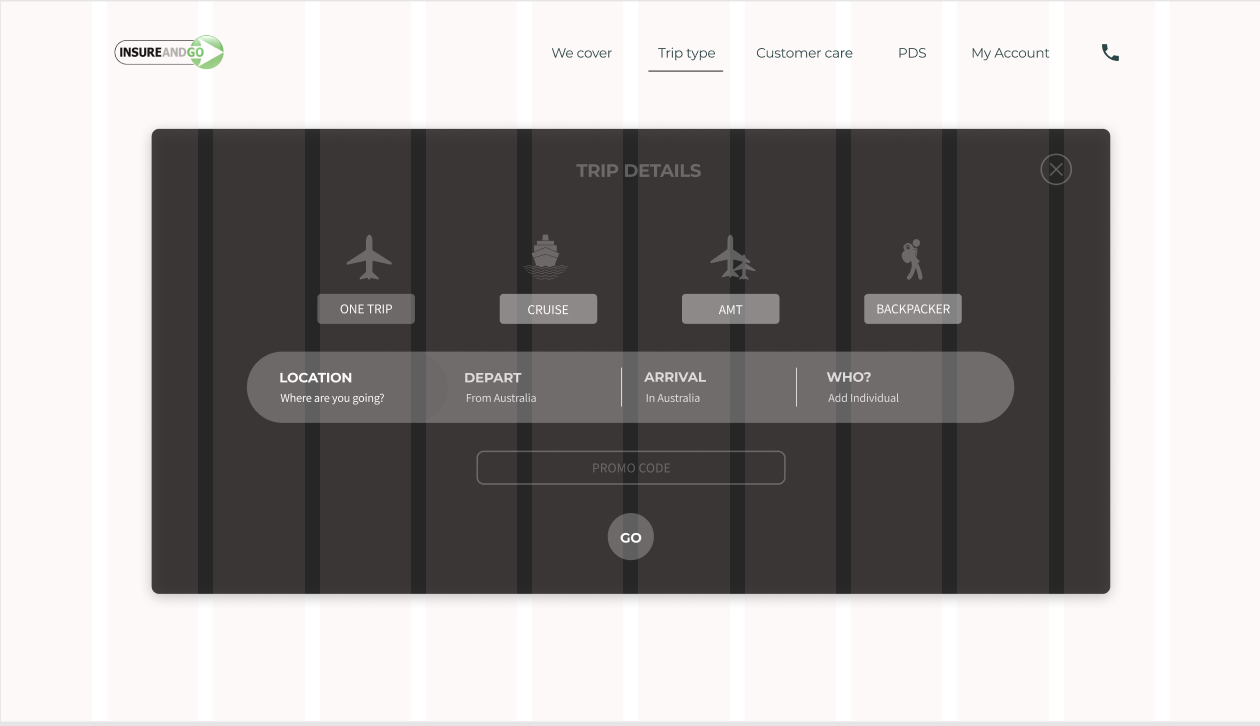
Lo-fi wireframes
During the sketching phase, I encountered several noteworthy pain points that were essential to address in order to fulfill user goals. I integrated these observations into Figma to construct an interactive prototype and subsequently conducted tests with our target personas.
Mid-fi wireframes
We transformed our revised hand-drawn sketches into a black-and-white interactive prototype using Figma. Within this process, we meticulously established UI elements, design patterns, and a visual hierarchy. To ensure effectiveness, we conducted tests with our target audience, which includes senior customers.
Findings
• Users considered the 'continue as a guest' option less practical.
• The 'register' option was the most commonly chosen, as it conveys empathy.
• Users identified the 'step-by-step' guide as the most valuable.
Findings
• Discovery #1
Users expressed a desire for the option to contact the call center for in-depth discussions, particularly in situations involving complications.
• Discovery #2
Users emphasized the importance of easy access to the "PDS" (Product disclosure statement).
• Discovery #3
Users preferred a streamlined and rapid process for obtaining insurance quotes.
Solutions & (Mid-fi)


User testing (before & after)


Visual design

Wrapping up
What have I learnt from this project?
• Extensive User Research is Essential
Our current achievements would have been unattainable without conducting thorough primary research. Engaging with our customers has provided us with invaluable insights that we've skillfully incorporated into our operations.
• Embrace Simplicity (KISS Principle)
In website design, especially for an audience aged 60 and above, simplicity is key. Simplifying the design not only demonstrates empathy and builds trust with users but also optimizes functionality for the best user experience.
BTS

Mockup
"This project serves as a recommendation and is solely for illustrative purposes. The numerical data presented within this document is for representational purposes only and may not accurately reflect factual information. It is important to note that the figures utilized herein are for demonstration and explanatory purposes, and should not be construed as precise or actual data."